L O A D I N G

ATM Portfolio - Digital Sales Tool for Immunocal

Role/Services
Client
ATM Portfolio, Designed with Axcan
Category & Year
Web design & UI/UX ©2025
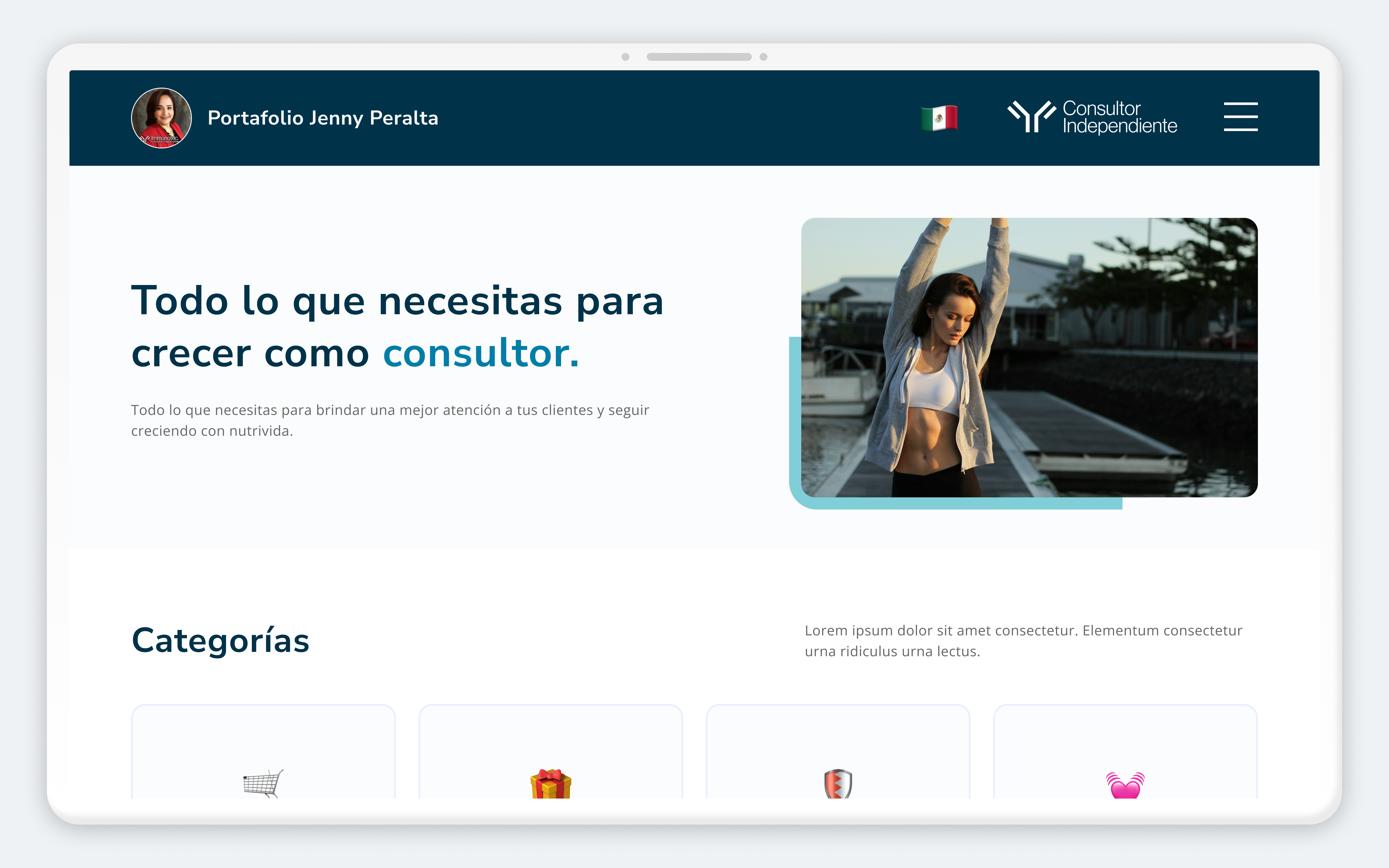
ATM Business - Cover
Project Overview

Immunocal, a globally recognized supplement brand, needed a centralized digital sales tool for their field sales team. Representatives were navigating complex product information, scientific notes, patents, dosage guidelines, testimonials, and performance metrics, while in live conversations with potential clients, with no clear digital resource to support them.

I led the full experience: UX strategy, interface design, and front-end development (HTML, CSS, JavaScript, Tailwind CSS), delivering a user-tested digital sales portfolio that improved navigation clarity and content discoverability for the sales team.

Problem
The sales team had no centralized digital tool for client conversations. Existing resources were fragmented across documents, PDFs, and disconnected pages, making it impossible to access the right information quickly during a live sales interaction. The core UX challenge was designing for a split-attention context: a user who needs to navigate complex content while maintaining conversational flow and eye contact with a prospect. Every extra second of searching costs credibility.

Understanding the user

Primary user — Sales Representative in Active Client Conversation
This context defined every design decision. The user isn’t at a desk with full attention — they’re mid-conversation, under time pressure, with a client watching. This created four strict UX requirements:
  • Content accessible in 1–2 taps maximum
  • Navigation based on recognition over recall, the user can’t afford to think about where things are
  • Interface professional enough to show directly to a client without undermining the rep’s credibility
  • Performance reliable on mobile and variable network connections
ATM Business Portfolio - User Persona
Goals
  • Restructure the information architecture for clarity and usability
  • Improve content discoverability and navigation
  • Support sales conversations with an intuitive digital tool
  • Design a clean, professional, and easy-to-use interface
  • Implement the interface with responsive front-end code
Research
Research was grounded in Nielsen’s usability heuristics applied to the existing information architecture. A deep content audit identified how the original structure created unnecessary cognitive load during time-sensitive use. Key issues:
Consistency and standards
Research was grounded in Nielsen’s usability heuristics applied to the existing information architecture. A deep content audit identified how the original structure created unnecessary cognitive load during time-sensitive use.
Recognition over recall
The original structure required users to remember where specific content lived. Redesigned to make all primary content categories persistently visible and immediately recognizable.
Visibility of system status
No clear indication of where the user was within the content structure. Added persistent section headers and active state indicators throughout.
Efficiency of use
The split-attention context demanded that expert users navigate to any content in under 3 interactions. The redesign enabled this through persistent navigation and logical content grouping aligned with the sales rep’s mental model during a client call. Findings were validated through testing sessions with actual sales team members, allowing iterative refinements before final delivery.
Key insights
  • Complex content requires strong information hierarchy
  • Clearer navigation reduces cognitive load
  • Grouping related content improves findability
  • Users need fast access to key information during conversations
User assumptions
  • Primary users are sales representatives
  • Users often access the tool while interacting with clients
  • Efficiency and clarity are critical during real-time use
  • The platform must be easy to learn and remember
Main user flow

The experience guides users to:

  1. Access the main portfolio interface
  2. Locate the relevant content category
  3. Review specific information or media
  4. Return or continue exploring related sections

This flow was iterated based on user feedback.

UX & UI decisions
  • Major improvements to the information architecture
  • Navigation redesigned to follow recognition over recall
  • Clear sectioning of content for faster scanning
  • Consistent visual language and spacing
  • Clean, readable layouts for dense informational content
Outcome
The final product is a live, user-tested digital sales tool actively used by the Immunocal sales team during client conversations. By redesigning the information architecture around the split-attention use case, the platform enables faster content access, reduces cognitive load during high-pressure interactions, and positions each sales representative as prepared and credible in front of prospects. The full front-end implementation in HTML, CSS, JavaScript, and Tailwind CSS ensures cross-device responsiveness, critical for a tool used on mobile during field sales calls. Owning both design and development meant zero translation loss between the Figma design and the shipped product.

Let's Build Something

Extraordinary Get In Touch!