L O A D I N G
June, 2025

M Drive

Role/Services
Designed
Client
M Drive, Designed at Klever Cookie
Category & Year
Web design & UI/UX ©2025
M Drive - Cover
Project Overview

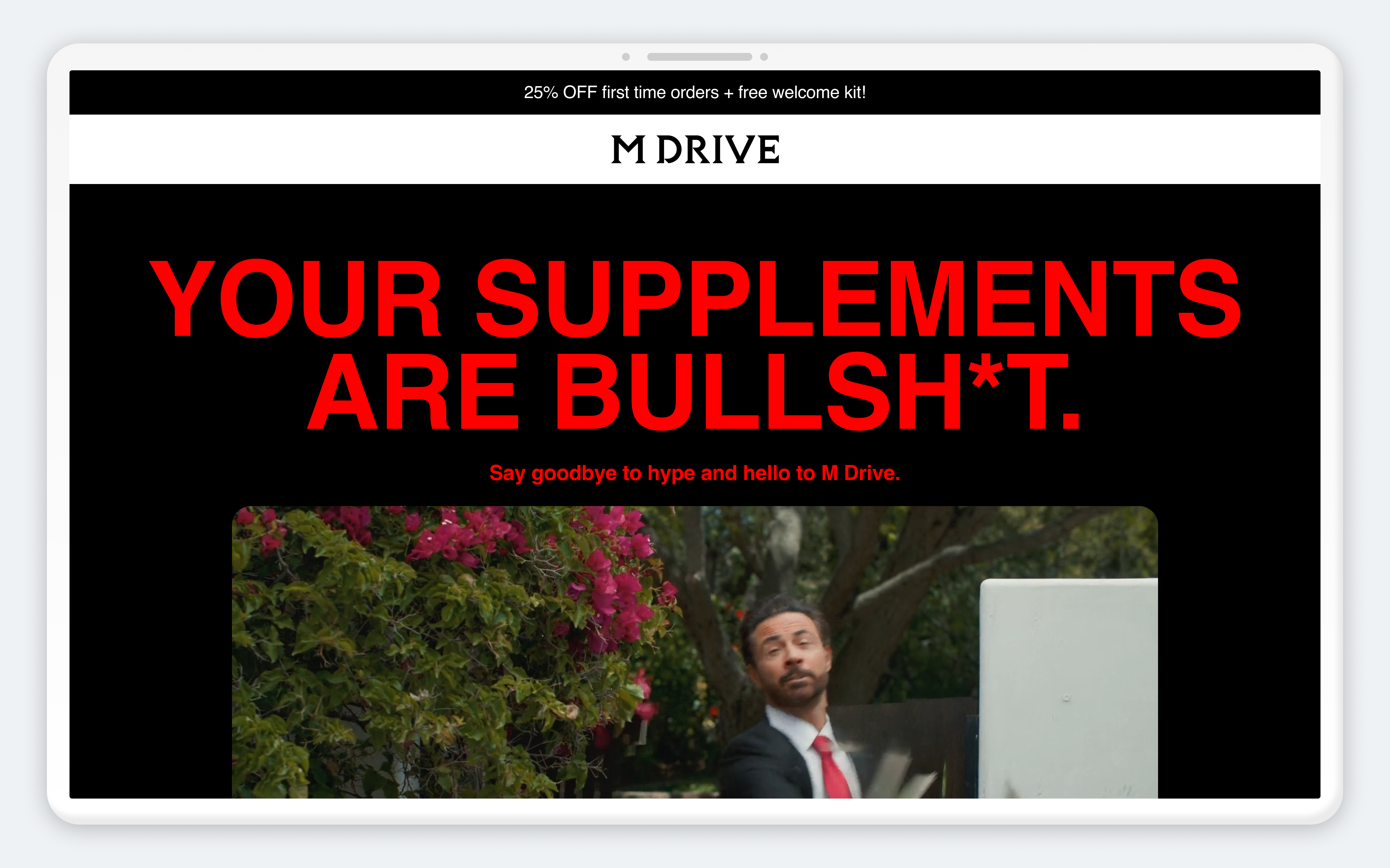
M Drive is a men's supplement brand that needed a top-of-funnel marketing campaign to promote an upcoming product launch. I was brought in as UI/UX designer to translate the campaign's creative brief into a landing page, structuring the information architecture and storytelling around a top-of-funnel audience: visitors arriving from ads or campaign content with high energy but low patience. I designed the landing page and handed it off to a developer for implementation.

Problem
The campaign needed a landing page that could immediately hook a top-of-funnel audience, visitors with no prior context beyond an ad or a campaign touchpoint, and guide them toward the product without losing their attention. A landing page that didn't translate the campaign's bold, confident creative direction into a clear, fast-moving experience risked losing that audience before they engaged with the product at all.
Goals
  • Translate the campaign's brand and creative brief into a landing page experience
  • Structure the page's storytelling specifically for a top-of-funnel audience with low patience and high intent to be convinced
  • Apply UX, accessibility, and CRO best practices to maximize usability and conversion potential
  • Deliver a clean handoff for development implementation
Key insights
  • A top-of-funnel audience needs the page's core hook in the first few seconds, so information architecture had to prioritize the campaign's boldest message before any supporting detail
  • Translating a brand's creative brief into a landing page isn't just visual styling, it required structuring the storytelling itself so the page's flow matched how a high-energy, low-patience visitor actually scans and decides
  • Without dedicated research for this project, applying established UX, accessibility, and CRO best practices was the way to keep the design grounded in proven usability principles rather than pure creative instinct
User profile
Primary users are top-of-funnel visitors arriving from campaign ads or content, with limited context about the brand and low patience for a slow or unclear experience, but high receptiveness to a bold, confident message if it lands quickly.
Main user flow

The experience guides visitors to:

  1. Immediately grasp the campaign's core hook and brand tone
  2. Learn about the product through fast-moving, storytelling-driven content
  3. Move toward the campaign's call to action with minimal friction
UX & UI decisions
  • Information architecture structured around top-of-funnel attention span, leading with the boldest message first
  • Storytelling-driven layout translating the brand's creative brief into a clear content flow
  • UX, accessibility, and CRO best practices applied throughout in the absence of dedicated research
  • Clean, developer-ready handoff to support implementation
Outcome
The landing page translated M Drive's campaign brief into a fast-moving, storytelling-driven experience built specifically for a top-of-funnel audience, applying established UX, accessibility, and CRO best practices in the absence of dedicated research. The design was handed off cleanly for development implementation. No post-launch results or feedback are available for this project at this time.

Let's Build Something

Extraordinary Get In Touch!